5 rebrands that we loved ❤️
Throughout history, there have been countless companies that have rebranded. Some businesses elect to make grand updates like changing their name, while others make small adjustments to “refresh” their visual branding. For many companies, making brand updates every few years helps them stay current. Whatever the reason, rebranding should always be strategic and intentionally aimed at addressing a specific business problem (ie - poor reputation, market confusion, outdated image, etc.).
Let’s look at some lesser talked-about rebranding efforts that we gave a thumbs up.
Bristol Meyers Squibb
Rebrand by Siegel+Gale (2020)
Siegel+Gale did a beautiful job humanizing and modernizing BMS. BMS’ old identity (created in 1989) was rooted in science and had a dated feel. Their branding also just blended in with the pack. S+G applied a contemporary design style to BMS’ visual brand, helping them truly stand out. The magenta color used in the primary palette is bold and highly recognizable, and S+G took the wordmark from “publishing house” to “modern medicine”. But the biggest change to BMS’ brand was the emotional pivot in image and messaging that made the company feel much more relatable. S+G was successful in injecting nobility and relatability into BMS’ brand — something that went a long way with both patients and HCPs.
“The new visual identity presented us with an opportunity to tell a new, more human story—one that represents the company’s commitment to patients.”
- Siegel+Gale


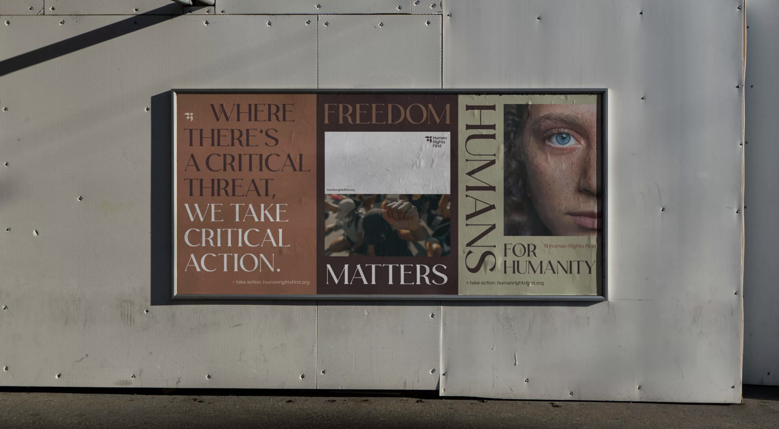
Human Rights First
Rebrand by Matchstic (2022)

Matchstic is an Atlanta-based agency that does fabulous work. Their book, Radically Relevant, is a must-read for anyone interested in branding. In 2022, Matchstic helped Human Rights First redesign their brand image, and they hit it out of the park. Everything from the color palette to the messaging feels directly connected to Human Rights First’s mission to “equip and activate the skilled to abolish oppression.” There’s a seriousness and grass-roots feel to Human Rights First’s new brand that is tonally spot on.
“The new brandmark better reflects an active network that's leading the organization forward. Progress-driving arrows evoke their consistent effort toward boundless freedom.”
- Matchstic


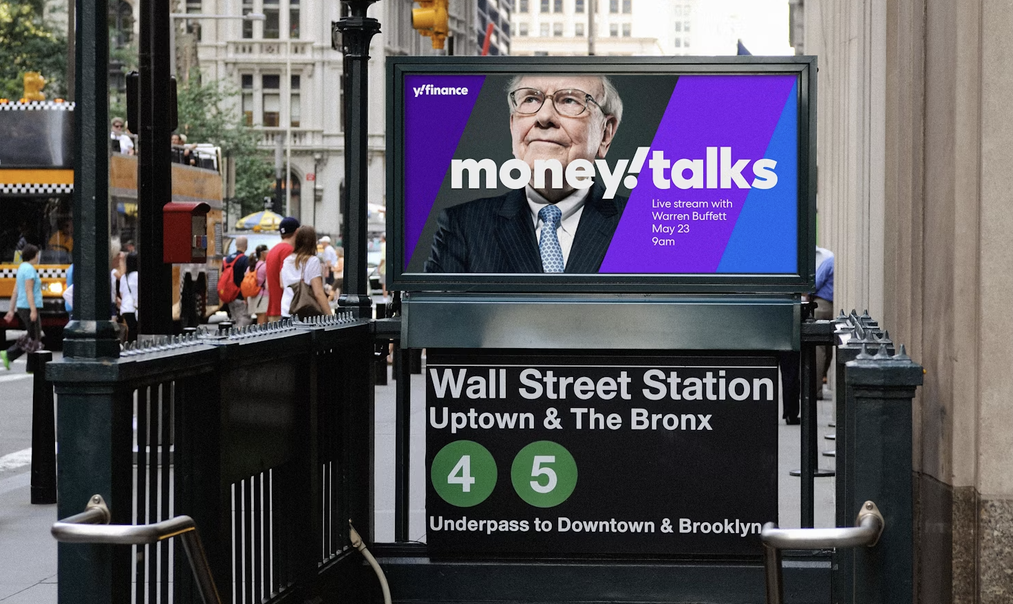
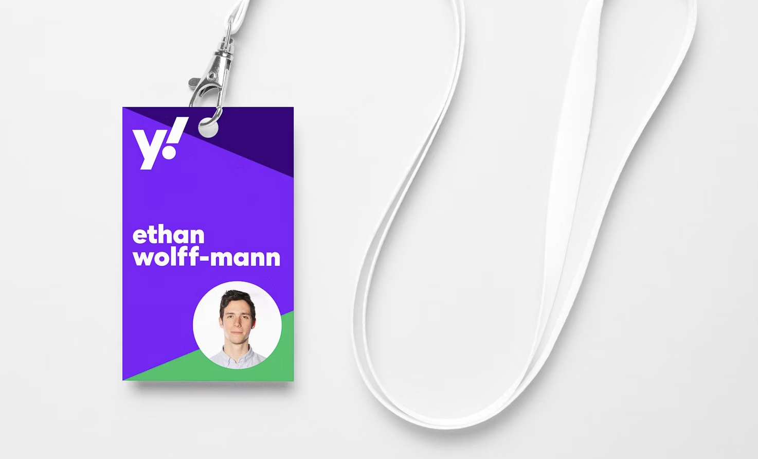
YAHOO!
Rebrand by Pentagram (2019)
This example is a larger rebrand that generated much more press than the others on this list, but the change was a much-needed breath of fresh air. Yahoo! struggled for years to appropriately define its brand in a current, differentiated, and category-appropriate way. Previous logos were stylized too informally (and almost comically). The updates were bold and flexible. Pentagram created a system that allowed Yahoo! to take the “y!” and use it interchangeably in marketing and advertising materials. They spawned evergreen brand recognizability that serves Yahoo! well to this day.
“The new brandmark better reflects an active network that's leading the organization forward. Progress-driving arrows evoke their consistent effort toward boundless freedom.”
- Pentagram

Mount Sinai
Rebrand by Siegel+Gale (2012)
This is another gem created by Siegel+Gale. This project is over a decade old, but it still does the trick. S+G brought meaning and intentionality to a brand that previously had none. As one of New York’s most respected healthcare institutions, Mount Sinai Medical Center had a rich history of medical excellence and research innovation; however, it struggled to stand out in a city full of prominent hospital systems. Mount Sinai wanted to “expand the possibilities of medicine,” and S+G created a simpler brand experience by streamlining the brand architecture and modernizing the logos and visual identity system. Today, the branding is highly recognizable to New Yorkers.
“Inspired by Mount Sinai’s biblical namesake, our visual identity features dynamic, interconnected lines and a fresh color combination to communicate the idea of forward momentum and a commitment to integration.”
- Siegel+Gale


HOUSTON SPACE CENTER
Rebrand by Traina (2022)
We’ve had the pleasure of working with Traina before, and not only are they great people, but they do great work. A couple of years ago, they completely modernized Space Center Houston’s brand. From the master logo to the supporting visual elements and messaging, Traina gave Space Center Houston an identity that was unique, ownable, and tonally perfect.
“The bold identity system equally suits Space Center Houston’s ambition, designed for equal footing with elite partners like SpaceX and Blue Origin, yet able to stand on its own with distinction.”
- Traina


BONUS: SPARROW PHARMACEUTICALS
Rebrand by GRAY GIANT (2021)
We’d be silly to make a list and not include some of our own work ;)
In 2021, as Sparrow Pharmaceuticals moved through the early stages of its corporate life, its leadership team reached out to us to help define Sparrow’s position in the market and develop branding that felt professional and sophisticated. During the Discovery phase of the assignment, we learned that the name “Sparrow” was not inspired by the bird, but instead from the character, Jack Sparrow, of Pirates of the Caribbean. That detail was not important to investors and patients, but it provided a foundational pillar for all branding.
“Everything from the bold color palette to the headline on the homepage of the website was created with a little flair, ala Jack Sparrow.”
- GRAY GIANT


Is your brand in need of an update? GRAY GIANT would love to help.