5 rebrands that we HATED 👎
In our last article, we looked at five rebranding efforts we loved. This week, let’s take a look at five that rubbed us the wrong way. None of these examples are meant to knock the agencies that were paid to do the work — but instead, the decision-makers who thought they were good ideas.
Remember, branding is not a logo, color palette, or campaign. It’s the feeling that people get when they engage with your products and services. And these changes gave us the ick.
TWITTER —> X
Unveiled in 2023

This might be the worst rebrand in modern history. It’s certainly my least favorite. Not only did Elon Musk strip Twitter of its charming (and popular) identity, but he swung it into a world of toxic masculinity.
At a time when Twitter’s algorithms were being accused of creating biases and allowing hate speech, Musk didn’t take action to repair the brand. Instead, he doubled down on the criticisms. Not only was the change cringe-worthy, but it hurt business. Traffic to X has dropped 30% this year. YoY revenue dropped 11%. And new users have dropped by 5%. Worst of all, despite Musk’s efforts to scrub X’s old identity, most people still call the app “Twitter”. The move has been an all-around failure.
“The rebrand wiped out considerable equity that had been accrued over many years by one of social media’s best-known properties.”
- Stephen Whiteside, WARC
WASHINGTON COMMANDERS
Unveiled in 2022
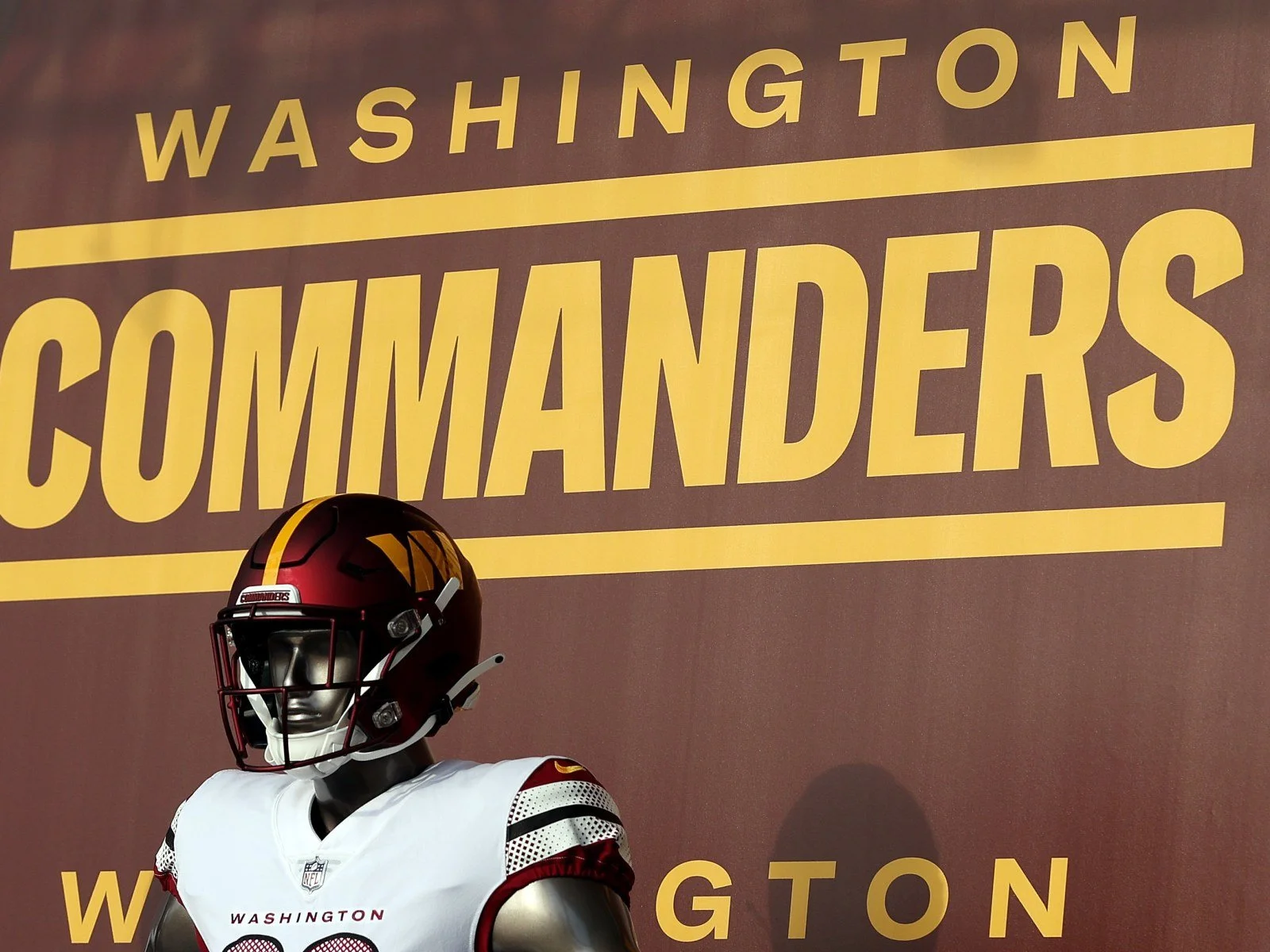
In 2021 — after years of pressure from advocacy groups — the NFL team formerly known as the Washington Redskins made the smart decision to abandon their racist moniker. Because the team didn’t want to rush the selection of a new name, they announced that there would be an interim year where they would be referred to as simply “Washington Football Team.”
Initially, people laughed at the vacant name change. But very quickly, the temporary name started to feel just right. It had a charming simplicity commonly found in the soccer world — ie. Manchester United or Fulham Football Club. In a way, it was a refreshing take for an NFL franchise.
However, just one year later, instead of taking the layup and keeping the name, the Washington Football Team went in the opposite direction. They adopted a new name that felt artificial and meaningless, the Washington Commanders.
Washington is an organization with a rich history dating back almost a century. Instead of finding inspiration in their tradition, they opted for a name better suited for the Marvel Universe. And the poor name choice may result in another expensive effort. There are rumors that the team is exploring yet another name change because of the lack of fanfare. You hate to see it.
“The Commanders name aligns with the most negative stereotype of our nation’s capital: a place full of out-of-touch bigwigs and stuffed shirts who enjoy imposing their will on the rest of the country.”
SEATTLE’S BEST COFFEE
Unveiled in 2010

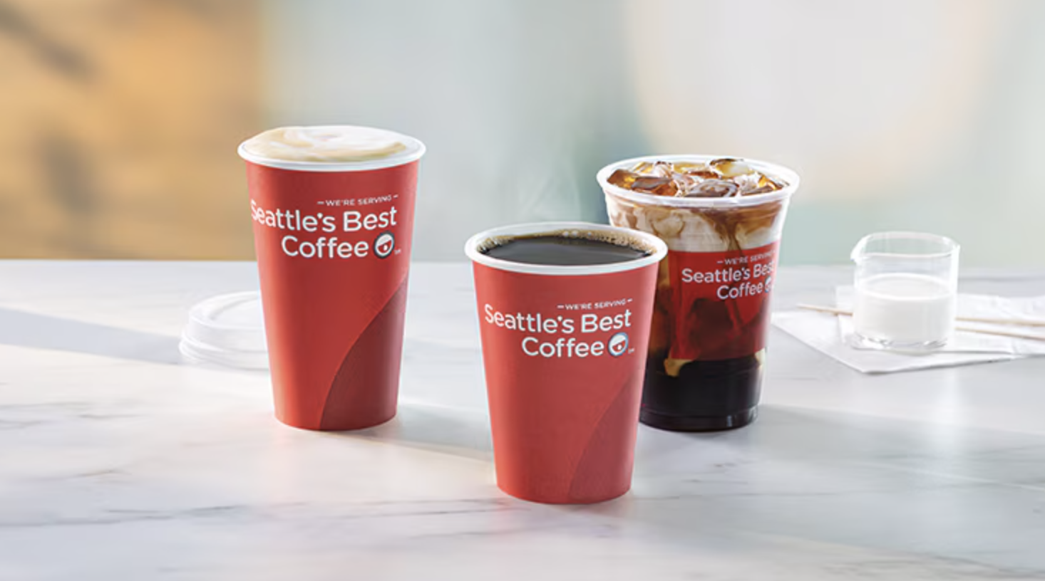
We can’t help but think that an agency convinced an executive they needed a visual branding change that they simply did not.
Seattle’s Best had tremendous brand recognition within the coffee space. When you saw their logo badge, you could smell their freshly brewed coffee. You felt that the company had been around for a while and that their product was quality.
In 2003, Seattle’s Best was acquired by Starbucks and largely ignored. But in 2010, when Starbucks decided to push the brand forward via fast-food chains and in-office coffee pods, they determined that a rebrand was necessary. They decided to ditch Seattle’s Best’s identity in search of something modern. However, they ended up with something so generic and boring with nothing distinguishable or memorable. The logo looks like a weird emoji, the cups look like something you would find at a one-off coffee shop in an airplane terminal, and the whole visual system is just blah.
In a world where consumer brands are frequently returning to their previous, better design systems (see: Burger King, Pepsi, and Burberry) we continue to hold out hope that Seattle’s Best will do the same.
“By not just ditching their old look, but rather obliterating it, they have officially placed themselves in the extreme generic end of the consumer products spectrum.”
- Mike Fossano, Premier Communications Group
HBO —> MAX
Unveiled in 2023
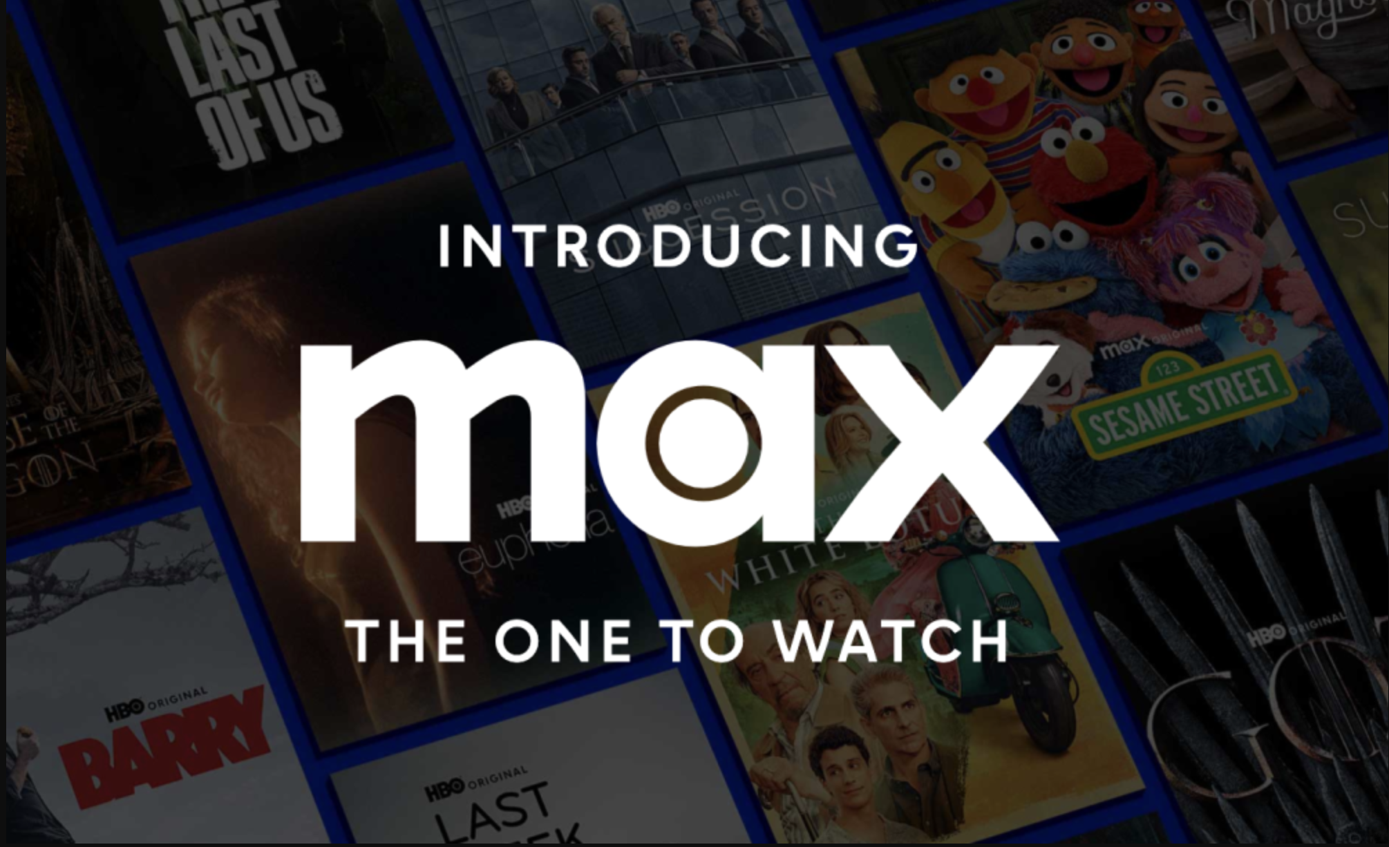
HBO meant something. It represented legendary TV series like The Sopranos, The Wire, and Game of Thrones. It brought us historic sporting events like Mike Tyson vs. Buster Douglas. I can still remember the anticipation for their weekly movie release every Saturday night. And I can vividly hear that iconic intro sonic buzz sound that ushered in all of their programming. HBO was a BRAND.
But times change and technology evolves. HBO felt that “Home Box Office” didn’t quite encapsulate their modern-day streaming services or expanded programming lineup. They wanted viewers to know they had more. So what did they do? They found a word that meant “more” and made it the name of their company — Max. For an interim period, they went by HBO Max, but they have since dropped HBO completely.
History aside, as a name, Max is bad. It feels forced and commonplace. Not to mention it leaned into portfolio brand, Cinemax (which had a reputation for airing soft-core porn!), over the parent company, HBO.
HBO has long struggled with its branding. Remember the HBO Go vs. HBO Now confusion? I sure do. The Max decision is a case of higher-ups thinking too literally about a creative challenge. Instead of redefining what HBO meant to viewers, they threw decades of brand equity out the window to take the “easier” path. The worst part? Like Twitter vs. X, people still refer to Max as HBO.
“HBO took four decades of prestige and casually tossed it all into a dumpster, lit a match, and cheered as it burned.”
Johnson & Johnson
Unveiled in 2023

Ughhhhhh. One of the main critiques of modern graphic design is that everything is getting too sterile and similar — commonly referred to as “blandification”. I can’t say I disagree. And blandification applies here.
In Johnson & Johnson’s case, they threw out an identity that had been around since 1887! The Johnson & Johnson script wordmark was the signature of founder James Wood Johnson. And it was iconic. When you purchased a J&J product, it came with a literal signature of approval. It represented the brand’s commitment to quality and health.
J&J’s new mark follows the trend of catering to digital audiences by making logos more legible and shrinkable. What’s ironic is that J&J doesn’t need to do that. The brand is so recognizable that you could take their script font, write any word, and your brain would think of J&J. That’s a level of branding that companies dream about achieving. Abandoning it is a wild decision.
“While the company strives to portray itself as a leader in technology and pharmaceuticals, it must not lose sight of the warmth and empathy that define healthcare interactions.”
- Kristine Liu, Medium
If your brand is in need of an update (or repair!), GRAY GIANT would love to help.