What makes a great logo?
A logo is the most basic representation of your company — your corporate signature. It represents what you stand for, the arena in which you play, and the sophistication with which you operate.
A corporate logo is not just a colorful illustration that you slap on the back of a business card or place in the top left corner of a website. To the outside world, a logo can represent hope. It can be a source of pride. It can signify quality, generate confidence, and create nostalgia.
A great logo can help boost brand equity.
Before we jump in, let’s get the terms down. While logos take many shapes and forms, generally, a logo contains two elements: an icon and a wordmark.

The wordmark is the font used to typeset the name of your business.
The icon is a graphic, illustration, texture, pattern or shape typically used as part of the core logo. Over time, when a brand is successful and universally renowned, it may elect to drop the wordmark and use just the icon.
Best Practices for Logo Design
Wordmark
1. AVOID COMMON FONTS
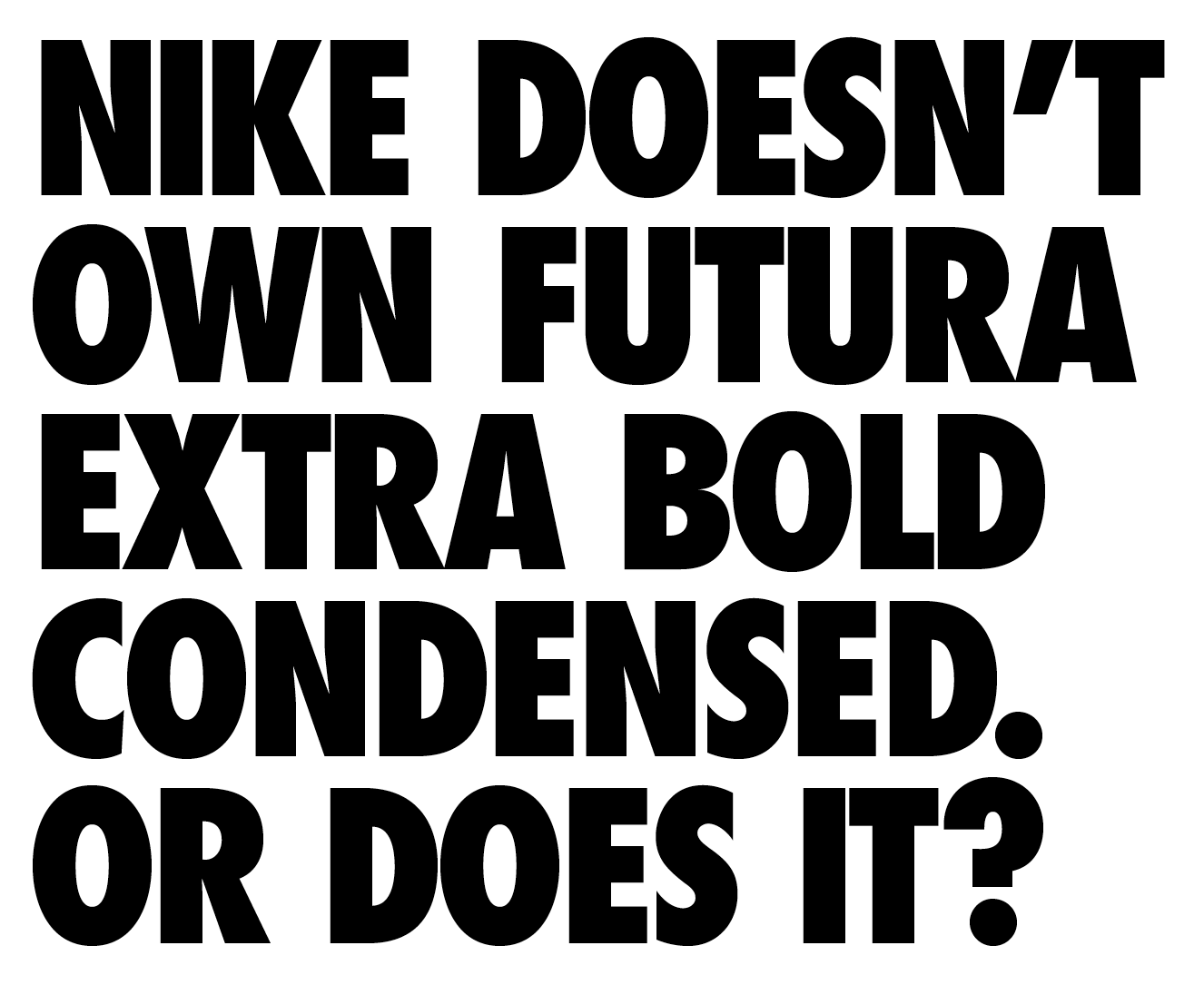
You must choose a font that is unique to you. Your wordmark font should not be highly recognizable nor readily-available to the public. Certain fonts are loved by designers and quite overused (looking at you, Gotham). Additionally, some brands have had tremendous success using specific font families. For instance, try using Future Bold Condensed without giving Absolut Vodka and Nike vibes.
2. CHOOSE THE RIGHT FONT CATEGORY
A font’s letterforms create its personality. Serif fonts (the ones with little strokes at the end of the letterforms) communicate seriousness, tradition, and reverence. Serif fonts are used heavily by the financial, legal, academic, real estate, and publishing sectors. Many luxury brands also use serif fonts.
Sans serif fonts (the ones without the little strokes at the end of the letterforms) provide a modern look, approachability, and better legibility. Sans serif fonts are the most popular choice for contemporary logos, comprising almost 70% of all modern identities (according to the neural networks at ChatGPT). Sans serifs are the font category of choice for tech, fashion, healthcare, retail, consumer, and telecom companies.
Other font categories communicate somewhere in between. Slab serif fonts (the ones with block-like serifs) are more approachable than serif fonts, while still providing a touch of tradition. Script fonts (the ones that look like fancy cursive handwriting) can deliver a range of feelings from elegance to whimsy to femininity.
3. DON’T GO TOO LIGHT OR TWO WIDE
For practical uses, your logo must be legible and scalable. Thin wordmarks don’t hold up well when reproduced at small sizes. An overly tall or wide logo will be problematic in layout because it will command an awkward amount of space. Obviously, if your concept involves using space as part of your idea, this can be disregarded.
4. MAKE IT YOUR OWN
You should never just type a font in and accept what your given. You need to make sure the font is properly kerned, spaced out (or in), and a reflection of the icon’s design characteristics. Pick up on the angles, curves, and geometry of the icon to see if you can inject some of that personality into the wordmark. Doing so will result in a more cohesive, complete lockup.
Some companies will opt to forgo the icon. In that event, the text must be completely custom and highly scalable.
Icon
1. KEEP IT SIMPLE
Many clients misinterpret the point of a logo and try to use the logo as a way to tell their full company story. That’s a mistake because your logo is rarely viewed without surrounding context — whether it be on an ad, website, business card, or other marketing asset. Your logo should be your stamp of approval. Thus, your icon should be, well, iconic. In general, you should use as few shapes, colors, and gimmicks as possible. Simplicity aids in recognizability and ease of use. A simple icon will also prove timeless, saving you the hassle of an expensive overhaul in the near future. Starbucks, which totes one of the most popular illustrative logos out there, has already simplified its core mark three times.

2. AVOID INTRICATE DESIGNS
Piggybacking off number one, you should avoid creating ornate illustrations, unless your concept is built around it. Logos with a lot of detail do not shrink down well. They are also difficult to reproduce in metal and glass, expensive to offset print, and usually require a separate version of the logo for small use cases. One notable brand, Cadillac, has struggled with it’s intricate master brand for over a century. They have gone through 29(!) different logo iterations since 1902, including four since 2000. That’s a tremendous amount of rebranding for something that should be the foundation of your visual brand. Most recently, they sucked the iconic gold and red colors out of their logo to follow the copycat trend of de-colorizing and flattening icons. They also changed their iconic script wordmark to a less memorable sans serif font. I’m guessing they will be doing rebrand #30 in a few years.
3. STAY IN YOUR WORLD...
Your icon needs to appeal to your target market. A good mark should arise from sector-specific visual cues that already exist in your space. Do your research and look at the competition to see which design decisions are appropriate from a color, style, and symbol standpoint.
4. ...BUT STAND OUT
While you want to be relatable, you don’t want to be just another face in the crowd. Don’t be afraid to be bold. In other words, wear the school uniform, but choose your hair style and shoes wisely.
TL;DR? CHECK THIS OUT
There’s a fabulous Designer/CCO named Allan Peters who shows how to inject these principles, and many of his own, into some of the world’s most popular brands. Head over to his Instagram feed for endless hours of scrolling, head nodding, and beautifully-simple branding goodness.
If you or your organization is in need of a logo, GRAY GIANT would love to help.